45% of businesses don’t have a mobile optimized site or app
This statistic from the Adobe 2013 Digital Marketing Optimization Survey is alarming. Businesses have seen massive growth in mobile traffic, yet only 30% surveyed in another Adobe study consider it a top priority in 2013. At Brick Street, we have made having a responsive mobile site a priority, noticing mobile devices have become the default screen for user’s content consumption. That said, there was a bit of a learning curve for us to embrace the constraints of mobile devices. With smaller screens, less attentive users, and a shorter time to engage, mobile sites demand minimal and functional design with an unrelenting single-mindedness to help visitors complete a task. In today’s blog post, I will share our project notes and review the site’s development with Lannie Le, the Creative Director and Partner at Pixel Dreams.
Focus on user experience
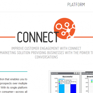
I’m sure Brick Street’s goals were similar to a lot of organizations- to create a digital hub to educate and serve customers and prospects 24/7. However, Lannie and her team pushed us to define our business objectives and focus on solving our ideal visitor’s challenges. This emphasis on the user experience drove all design considerations. If we could demonstrate that our products were complex (yet simple to use), brought out both the humanist and technologist in marketers, and addressed an organization’s concerns and messaging requirements, we could positively affect our bottom line. We decided the site’s top goal was to request a demonstration of our CONNECT 5r.1 multichannel marketing platform. The secondary objective was to capture marketing-qualified leads through e-newsletter registration, social media follows and visitors sharing contact information in exchange for case studies and research reports.
As a start-up, we knew we had to make a great first impression. In fact, according to a Google study, 52% of users said that a bad mobile experience made them less likely to engage with a company. Le encouraged (sometimes pressed and persuaded) us to incorporate the latest trends in web design to accomplish our goals. That meant a responsive layout, flat UI, large & high contrast typography, a long page with clearly divided sections and a parallax effect for scrolling.
Don’t debate
There was no debate regarding having a single responsive website rather than a separate mobile website. The extra time and resources to share content over multiple sites, and the possible dilution of our search engine optimization efforts, was not worth the investment. Moreover, Google “recommends webmasters follow the industry best practice of using responsive web design, namely serving the same HTML for all devices and using only CSS media queries to decide the rendering on each device ”, and Bing does not index m. sites under their “One URL Per Site” policy.
What is Responsive Design?
Responsive web design allows content to adapt how it renders according to the screen size or orientation of a PC, smartphone, or tablet, no matter the device’s make or model. The technique consists of three components: fluid grids, fluid media and CSS media queries. Media queries control the site’s layout and style display by detecting the device or screen size. Responsive design guarantees a good user experience. Media queries enable only the display of relevant code or images and limit resource intensive transitions that reduce download times, and for some with limited data plans, money.
To determine the list of devices, platforms and browsers to support, Pixel Dreams reviewed our existing traffic analytics from different periods. This historical data also helped us to determine the trend of traffic technologies. This was critical, as the website was our first venture into responsive design, but would not be our last. Our project road map included mobile optimizing our blog, email, and landing pages.
Lannie assured us that “While the overall design elements are the same, the layout must adapt to fit different screen sizes. This means the reduction of two or three columns to one, which increases the column height. This means more scrolling. However, scrolling on modern devices is pleasant enough that it happens unobtrusively to the browsing experience.”
Start with mobile
Luke Wroblewski’s book Mobile First has become a go-to resource for many digital marketers. Pixel Dreams is a mobile first convert as well.
“Traditionally web design has been desktop first, then mobile. With the increasing mobile usage, we have recently switched to a mobile-first approach. This means starting with the most essential functionality and design elements, then add on as we move up to larger screen sizes.” explained Le.
Prioritizing which functions and design elements are essential also drives the display order of the content. This hierarchy builds on customers’ needs and wants. For Brick Street’s website, Pixel Dreams used bite-sized pieces with visually appealing graphics to help communicate the content’s importance.
Lannie expounded, “We also contextualize content based on typical “browsing” behaviors, in combination with what enterprise-level customers expect to gather for decision-making through clear hierarchy of typography, color usage, and content chunking.”
To accomplish our objectives, the design of the website’s navigation followed this mobile first approach.
“[A] sticky top navigation that collapses into an expandable mobile menu, and collapsible content sections where content is heavy” is an example Le cites.
In addition to a great first impression, the next step was to establish trust with our visitors through clear and evidential facts. We decided to tell our story visually with mobile-friendly infographics at the top of the site. For example, the infographic stating that 3 of the top 5 global financial institutions trust Brick Street CONNECT to deliver their communications helps to establish our credibility. Once the visitor scrolls down to learn more, the infographic disappears and a sticky top navigation bar is in place to navigate the site easily.
Continue to experiment
“All the world is an experiment, the more experiments, the better the life”, and that is true for digital marketing as well. – Ralph Waldo Emerson
At Brick Street, we too believe in continuous improvement and look forward to experimenting with our website. Some decisions, like choosing a single column layout due to the mobile screen’s limited width, or simplified child pages with one long page, will probably not be at the top of our list. However, long single-column pages make scrolling a necessity. To ensure scrolling remains a smooth and intuitive user behavior, we plan to test a variety of parallax effect designs in our website, blog posts, and emails. These will include StyleCampaign’s recommendations for the use of diagonal or vertical lines, super tall or wide images, and chain link layouts connecting content via a design element. We will also take Le’s recommendation to test responsiveness, cross-platform cross-browser rendering, load time, functionality, and cross-linking.
Your thoughts?
Have you had a similar experience? Share with us your process and tips for designing and optimizing websites for a mobile audience.
Resources:
Keep up on the latest multichannel marketing news with Brick Street’s monthly email newsletter. It is a must read for today’s marketing technologist. Get it now.
Speak Your Mind